Home / Reviews
Judge lists, timers, navigation and support
This sheet scores whether a casinoclub lobby can be read as a document. It does not score excitement.
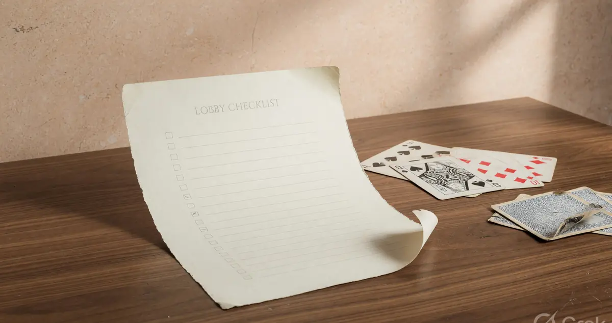
A review that begins with atmosphere has already left the shortlist. This usability sheet begins with whether format, value and seats share a row. If they do not, the rest of the marketing stack is noise.
Judge the lobby as a document
A rummy lobby is a table of contents. If you cannot find format, stake or point value, and open seats in one glance, the document has failed. Visual polish does not repair that failure.
casinoclub may ship a fine lobby. This desk has not published a dated screenshot audit, so no score is invented. You can still carry the criteria into whatever screen you meet.
Readers who want a five-star badge should leave. Readers who want a checklist should stay.
Lists that do the job
One row, four facts: format, value, seats, drop preview if any. Secondary facts (average duration, ping, friend presence) can sit behind a disclosure control. Primary facts cannot.
Infinite scroll that reshuffles rows while you read is a fault. So is a filter that forgets Points versus Pool after one back tap.
If thumbnails are identical across formats, the list is leaning on you to read labels. That is acceptable only if the labels are large.
Timers you can see without hunting
A turn timer should live near the hand, not in a settings drawer. Buried timers create accidental drops that look like user error and feel like product error.
This desk will not invent casinoclub's timer length. A good timer is visible, pause-policy is written, and a disconnect rule is written.
If those three are missing, treat every table as a table that can bill you for a frozen phone.
The discard lip is an accessibility issue
Colour-only cues fail. Overlapping cards fail. A last-discard that sits under a chat bubble fails. These are not aesthetic notes. They cause illegal pickups.
Framed photography on this site keeps the lip readable on purpose. A product that cannot match that clarity in its own client has a usability debt.
Zoomed hands and tiny phones make this worse. Test at 320px of courage, not on a tablet you do not carry.
Navigation depth
Cashier, limits, help and the table list should be reachable in two taps from a hand. A product that hides limits behind a marketing carousel has told you its priority.
This is why the homepage uses progressive disclosure for scoring and KYC instead of dumping a FAQ. The product should do the same.
If you need a third-party 'how to find X' video, the navigation has already failed the shortlisting test.
Support as a path, not a vibe
Findable help names a ticket, an email, or an in-app thread. This desk has not verified a public casinoclub phone, so a phone number here would be fiction.
Editorial contact on casinoclubin.com is a different door. Use it for this website. Do not send operator wallet disputes there.
A support path that demands a social login this desk cannot verify is another reason social icons stay hidden.
What a usability review will never become
A winner story. A bonus ladder. A comparison 'versus 11 other apps' with invented scores. Those patterns belong to a different kind of site and a different evidence standard.
If casinoclub later publishes a design system or a status page, those can be cited. Until then, criteria stay ahead of conclusions.
The brand review note repeats some of this on purpose from a product-evaluation angle, not a lobby-anatomy angle. The headings differ.
Carry the sheet to the next task
If the lobby fails the one-row test, you do not need a strategy note. If it passes, confirm KYC and law. Usability is not legality.
PLAY NOW after a failed lobby is curiosity, not a decision. This lab is built for decisions.
Write down the four facts from the row you would actually join. If you cannot, you are not shortlisting. You are browsing.
Questions readers send
What does this usability sheet score?
Lists, timers, discard lip, navigation depth and whether a help path is findable. It does not score bonuses or 'trust'.
Why are there no star ratings?
Stars without a measured sample are decoration. This desk has no verified casinoclub measurement sample.
Is a pretty lobby a good lobby?
Only if format, stake and seat count share one row. Decoration that hides those three is a fault.
What if support is only a chatbot?
A chatbot can be a path if it produces a ticket ID. A loop that never produces an ID is not a path.
Do you test on both app and web?
This note describes criteria, not a lab log. No device test log is published because none was kept as a formal sample.
Where should I go after this sheet?
Safety for KYC and payments. Responsible play for limits. Brand review if you want the same criteria without the format lesson.
Take the one-row test to whatever screen you meet. If the row holds, continue into Safety. If it fails, you already have your review.
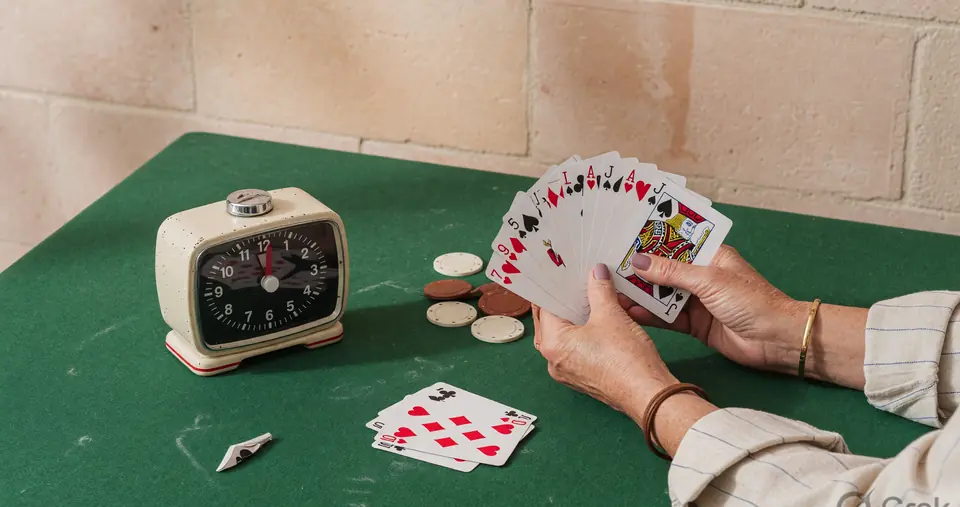
One more veto from the small line
If the small line that names format, value and seats is weaker than the gift banner, veto. If colour alone carries the format, veto.
If help takes more than two taps from a hand, veto. If the last discard sits under chat, veto.
If a carousel moves the row while you read, veto. You do not need a lab log to own a veto.
You do not need a star to confirm it. Take it to the brand wrap if you want it written as a gap.
Or leave the evening. Usability is a document problem.
Shouting documents are still documents. Read the small line.
That is the whole extra pass this sheet still owed you.
Lobby copy that tries to replace a row
Words like premium, VIP, exclusive and lightning do not name a format. They try to replace a row. If those words are larger than the point value, the document has failed.
Countdown banners for gifts are not timers for turns. Mixing those two clocks is a usability fault and a responsible-play fault at once.
A carousel that auto-advances while you try to read seats is an attack on the one-row test. Pause it or leave it.
Colour-only format cues fail many readers and fail anyone on a cheap panel in sun. Text must carry the format.
This pass is still not a casinoclub lab log. It is a way to read whatever marketing stack you meet without being hired by it.
If the copy is louder than the row, you already have a veto. You do not need a star to confirm the veto.
Take the veto to the brand review wrap if you want it written as a gap. Do not stay to be convinced.
Usability is a document problem. Treat it like one. Documents that shout are still documents. Read the small line.
A narrow-width pass you can run without a lab
Hold the phone at a narrow width, or use the smallest font your eyes allow. Ask whether the format name still fits on one line. Labels that wrap are already competing with the timer.
Tap the last discard. If you hit chat, emoji or an overlay instead, the lip has failed. Illegal pickups at this width are a product problem as much as a user problem.
Open help from inside a hand. Count the taps. More than two is a finding. A help entry that dumps you on a marketing carousel is a finding.
Rotate the phone. If the row loses its value field, the list is not a document. It is a poster that forgot its job.
This pass is not a formal sample and is not a casinoclub test log. It is a method you can run on whatever screen you meet.
If the pass fails, you do not need a strategy note. You need a different evening.
What star ratings usually hide
A 9.4 with no date, no sample size and no criteria is a costume. This sheet refuses the costume so the one-row test can stay visible.
Stars also hide conflict. A site that earns on a hop and still prints a 9.4 is asking you not to notice the hop. Our hop is disclosed and our stars are absent.
Stars hide change. Lobbies ship. A rating from last year is a different product. Dates belong on the register, not inside a badge.
If you need a number, make one after you run the narrow-width pass. Write fail or pass. That number is uglier and more honest.
The brand review wrap repeats the gap list from a product-evaluation angle. Do not expect a second score there either.
Leave when you have a veto. Staying to hunt a compliment is how usability notes become brochures.